doing the bare maximum
doing the bare maximum
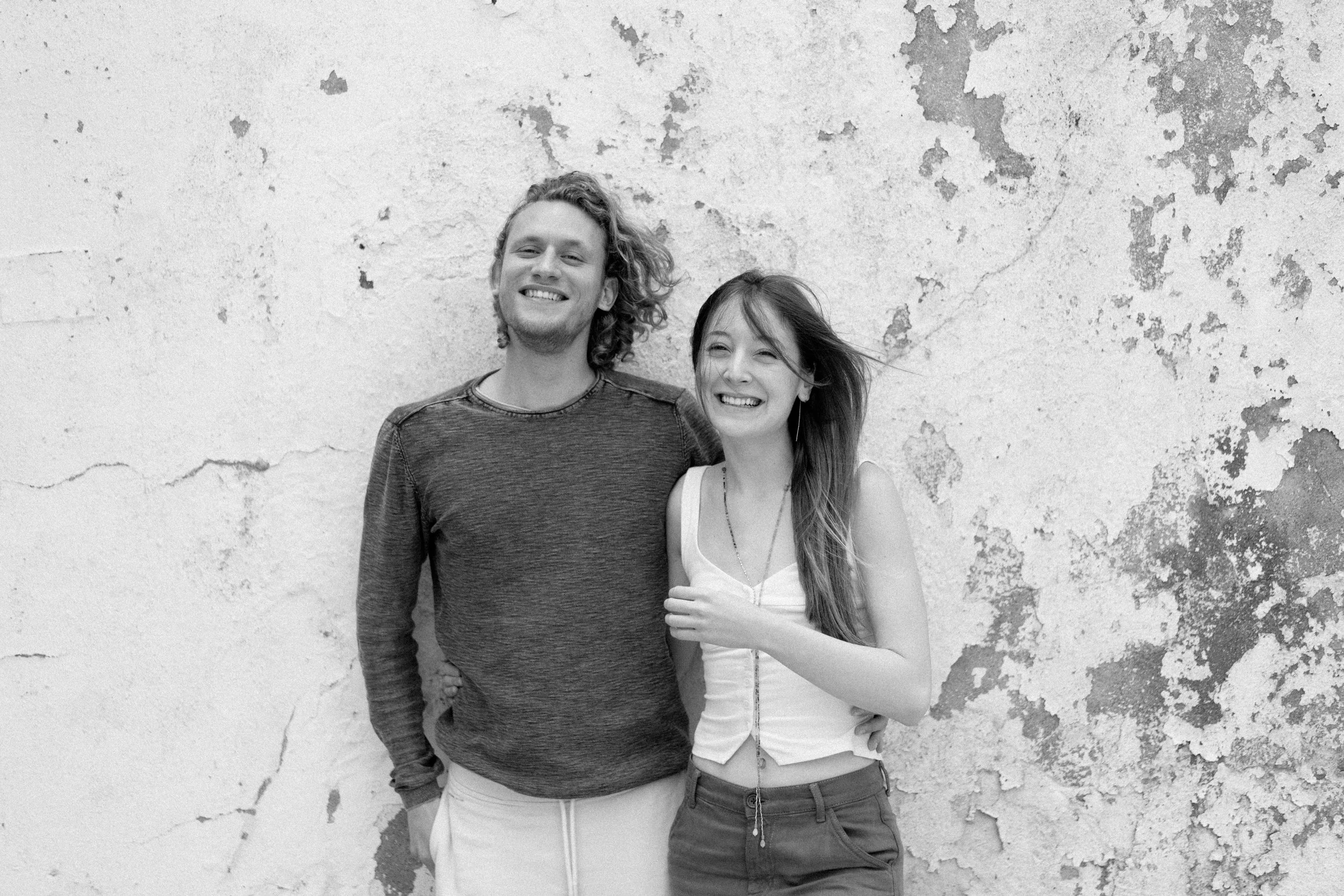
Together, Nikitas & I make n & i, a creative studio committed to doing the bare maximum! Oh, by the way, my name is Ilia and it’s more of a creative home.
Why do we do what we do? Well, at first, it was to satisfy our own creative needs as entrepreneurs. While this remains more true than ever, today it is to also satisfy other entrepreneurs’ needs from an entrepreneur’s POV.
How do we do it? By doing the bare maximum! We do the most we can possibly do and without you asking us to.
What do we do? From creating your brand’s identity and manifesting it in your branding, packaging, and website to offering additional, ever-expanding services such as poetic writing and artistic implementations.
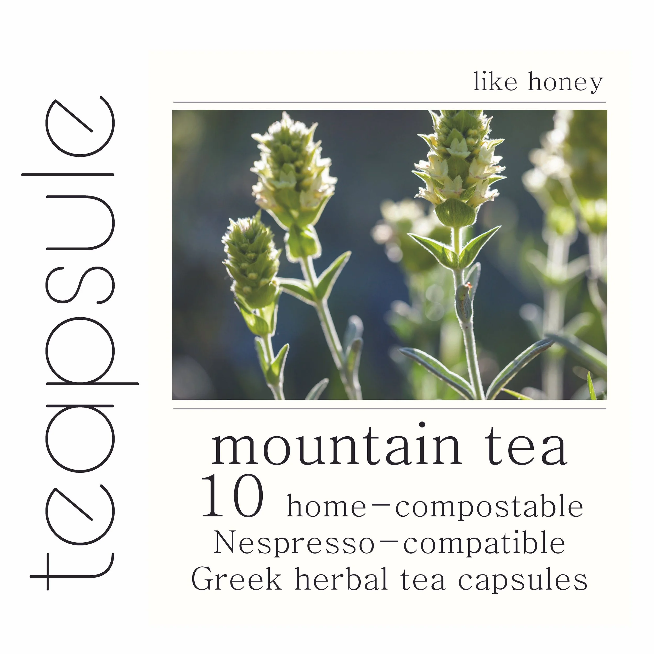
The name came to us quickly… Descriptive of the product itself and, perhaps, one day of the product category as a whole: Teapsule. Some of you call the company tea capsule, but that’s okay with us. We’re confident you’ll merge the two words in the near future. Some of you may read the logo backwards, then forwards and backwards again. That’s also okay with us; after all, Teapsule seeks to merge tradition (backwards) with innovation (forwards), a philosophy also reflected by our two chosen fonts.

Teapsule, our first creative project and business venture
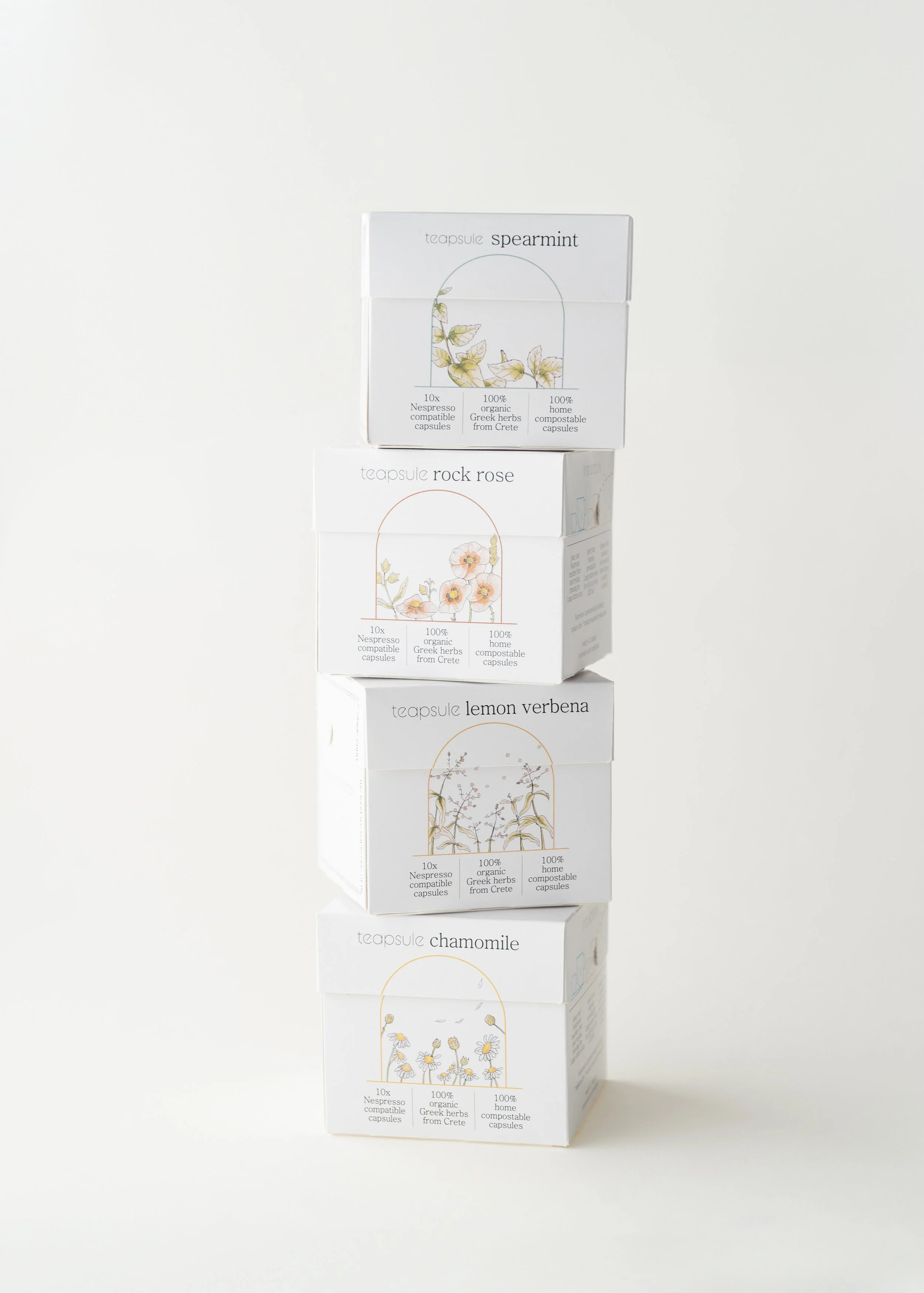
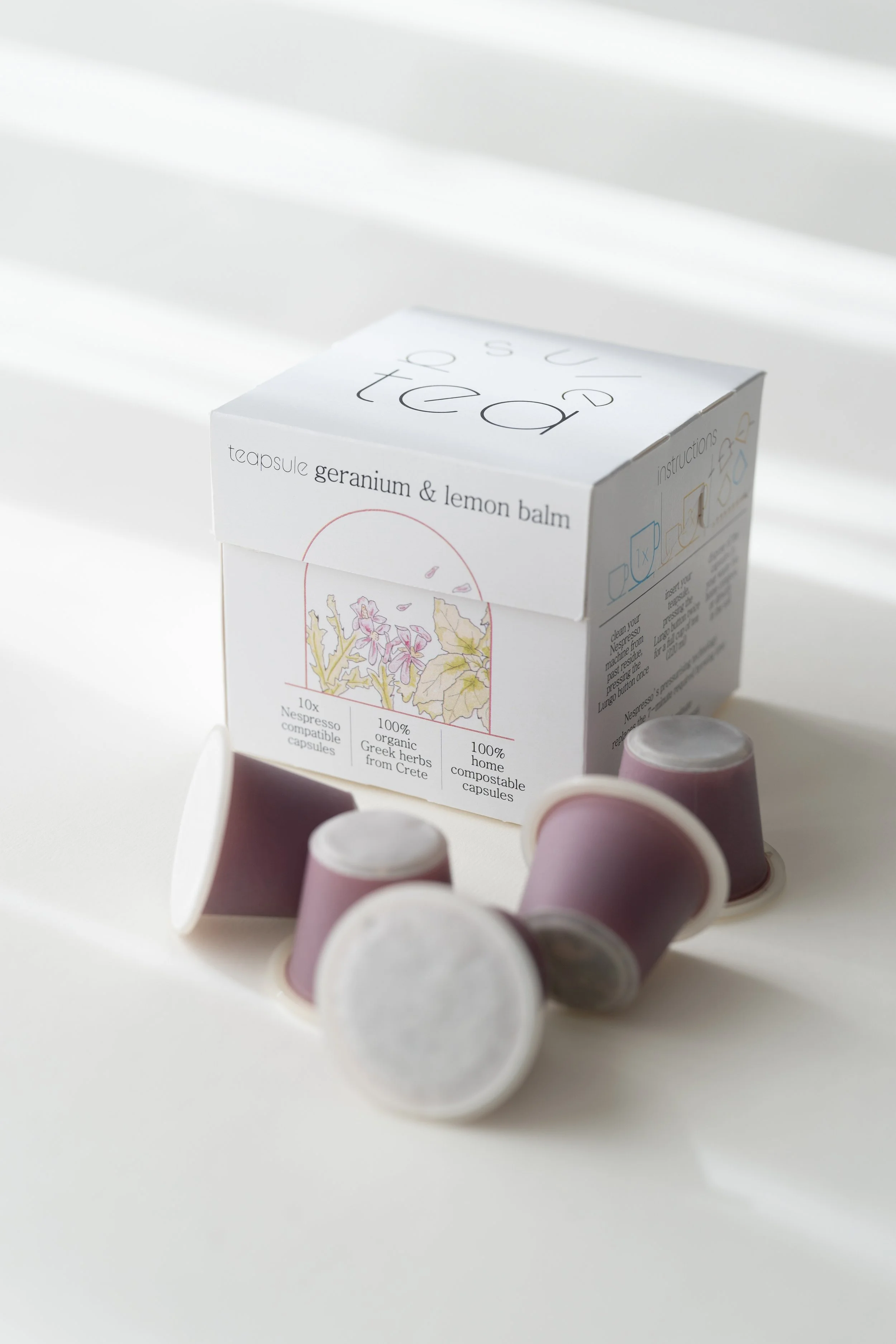

Cleanliness of flavour = cleanliness of packaging
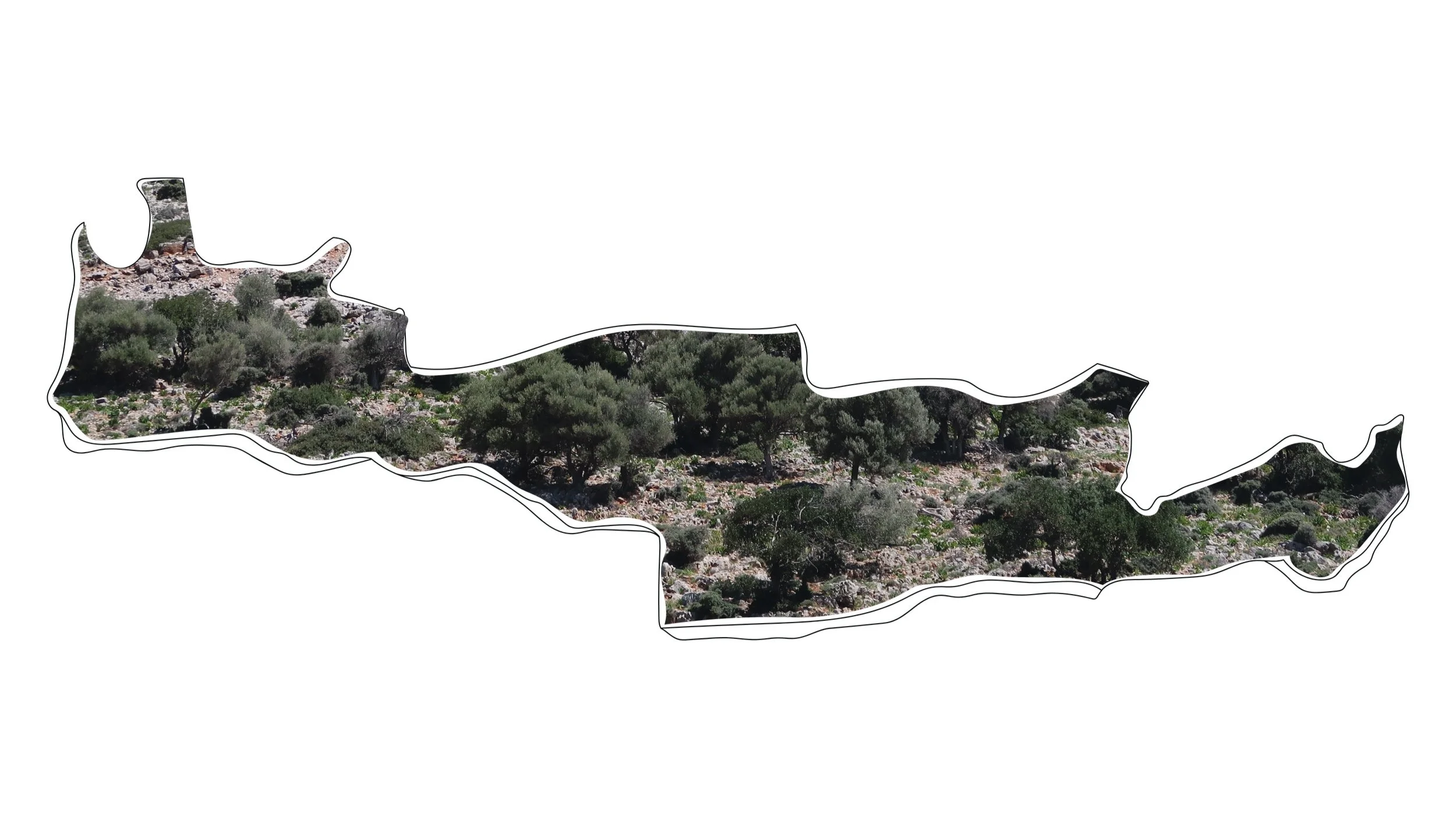
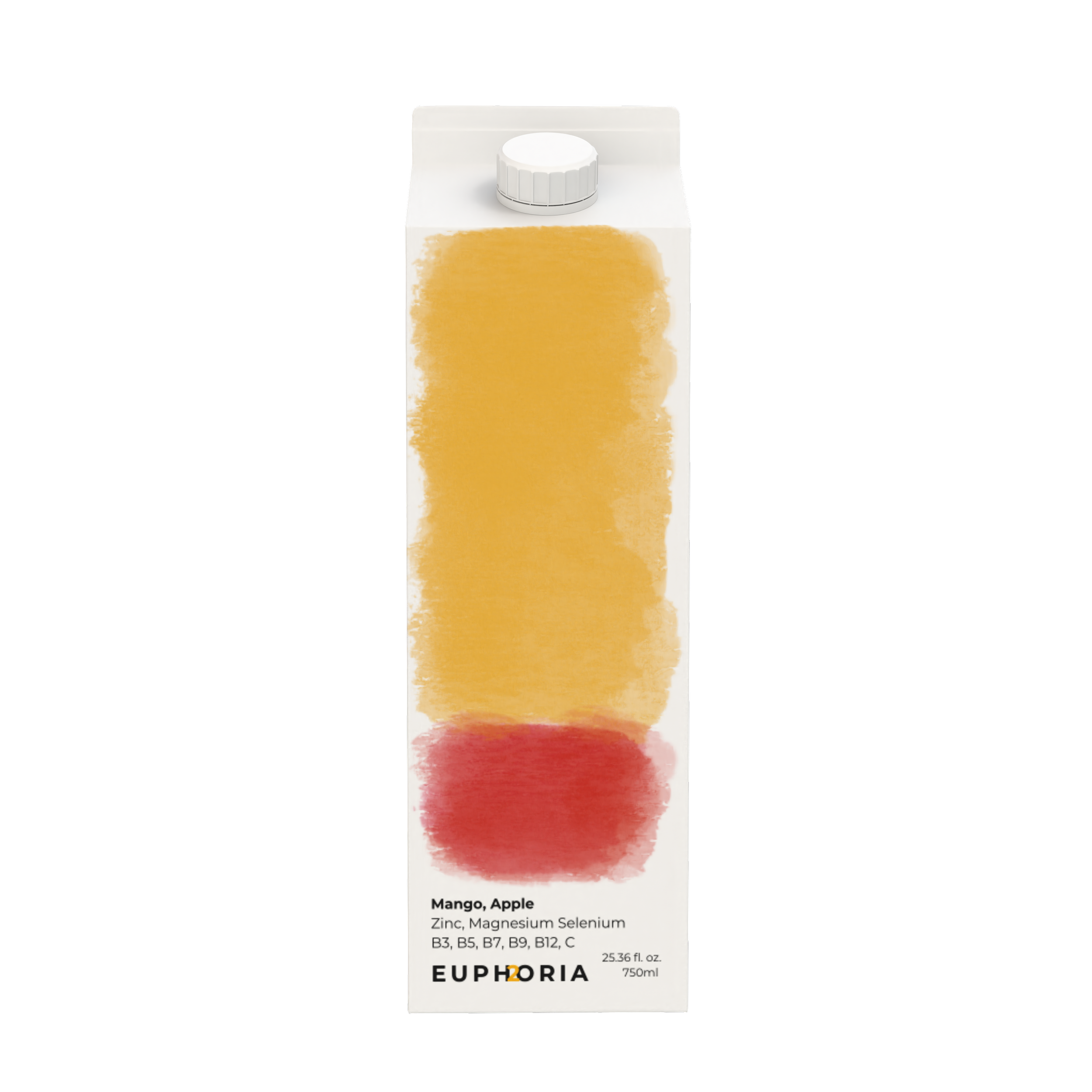
Three components: (1) organic Greek herbs from Crete, (2) in Nespresso-compatible, (3) home-compostable capsules
Circularity in concept and design, taking inspiration from the capsule’s shape as well as from Cycladic architecture
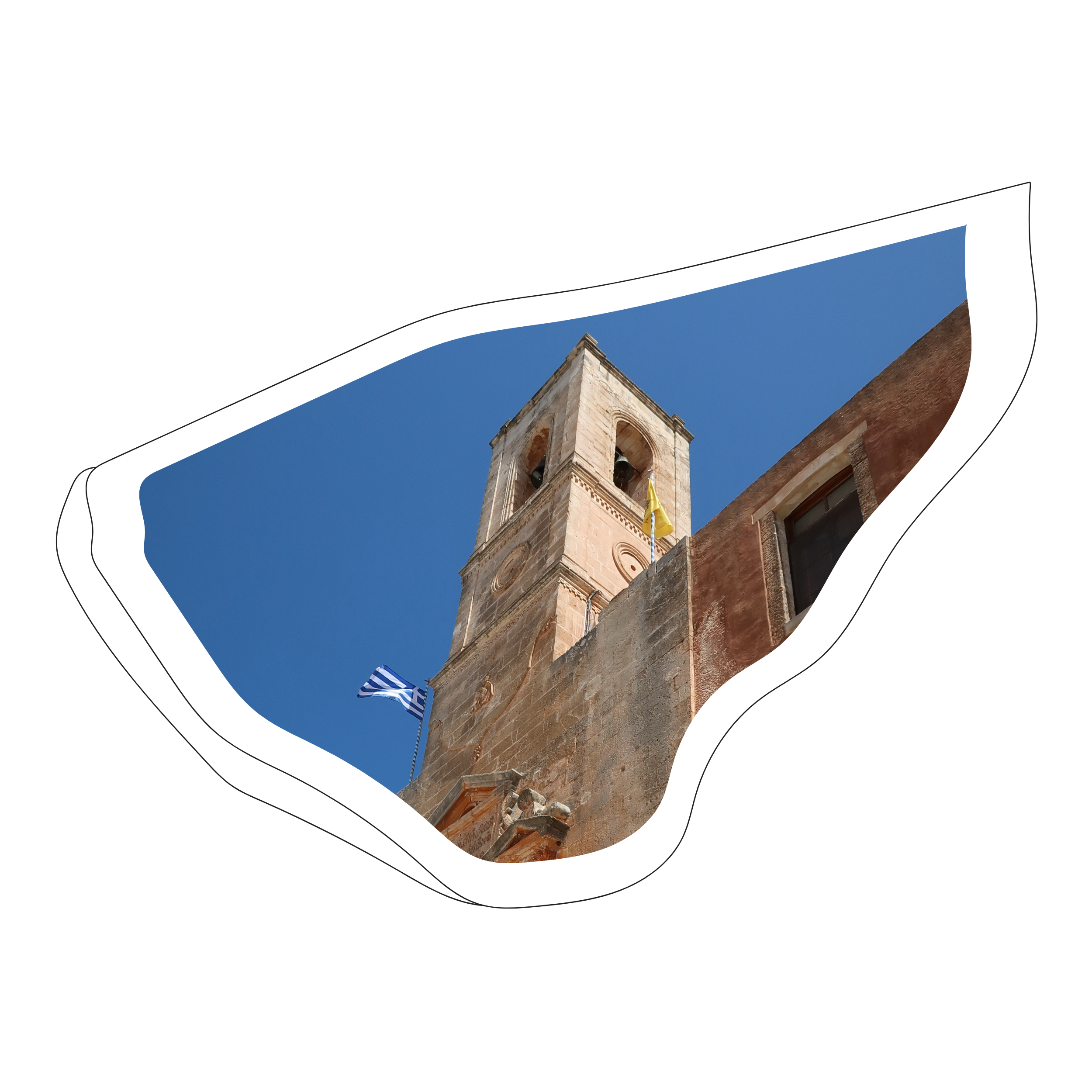
CREAT, a Cretan brand with a mantinada or two
original photos
While we did not design CREAT, we did realise that mantinades are at the heart of the Cretan heart.
A mantinada is a spontaneous poem composed of a 15-syllable rhyming couplet in Cretan dialect.
Remaining true to the mantinada’s spirit and form, we wrote some mantinades (in English, of course) to hopefully make you chuckle while telling you a thing or two about each product.
+ we also designed CREAT’s website
Oh, like an (extra) virgin embraced for the very first time,
Made with very fresh olives, so your heart long beats next to mine.
Hippocrates called it “the great healer,” Homer “liquid gold,”
olive oil is sacred to Crete and to Greece, let it be told.
If breakfast is indeed the most important meal of the day,
then start your day with dakos that’s what Cretans do always say.
Maybe it rings a bell, the irrational Greek letter π…
Ring ring! No longer a headache, but the Cretan pie to try!

OLEF CHEF

OLIVIA HEART

LIV ANTIOXIDANT
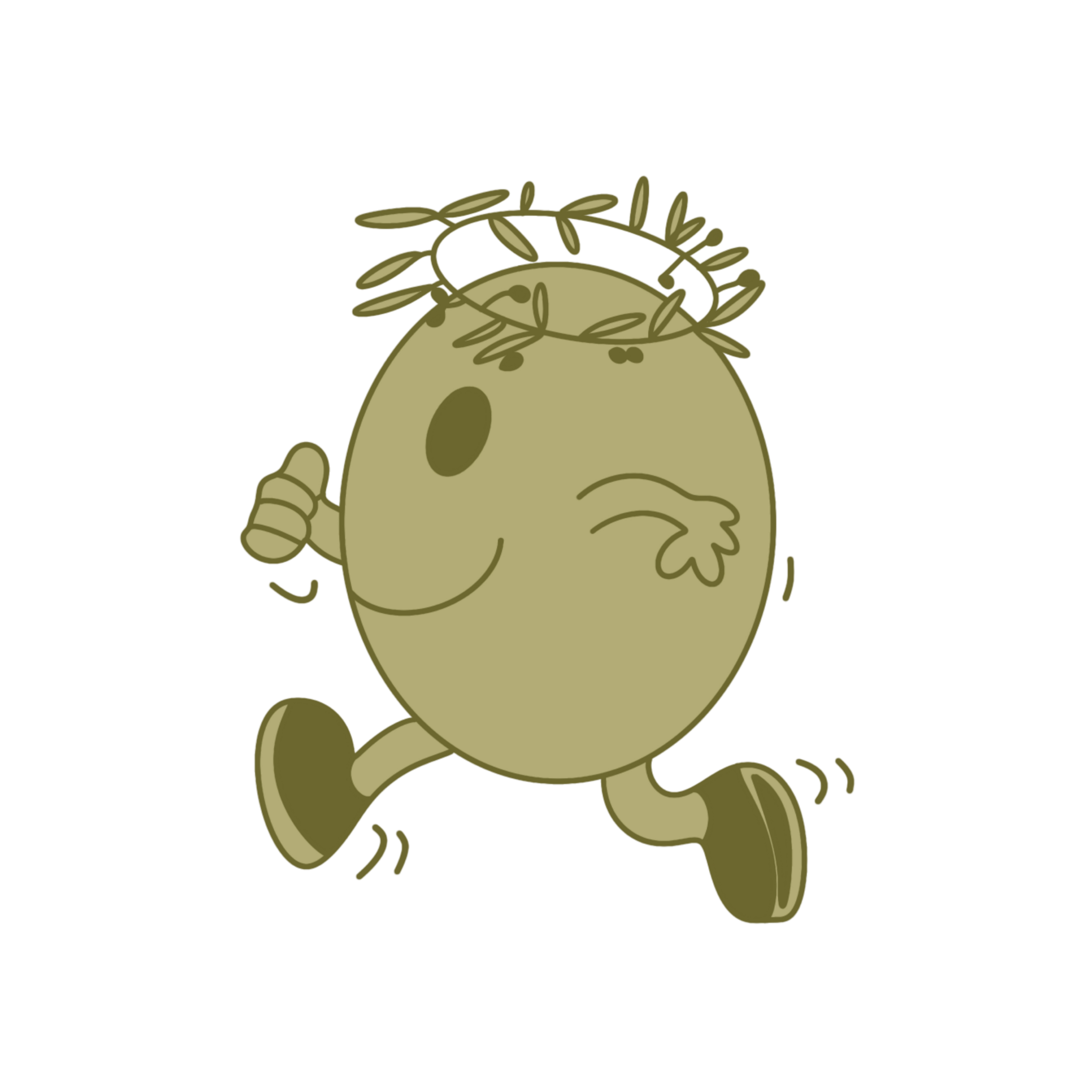
OLLIE OLYMPIAN

OLIVER MUSCLE

Olive Roots rebrand, a play on the polka dot pattern

Oli, Greek olive oil for the US market


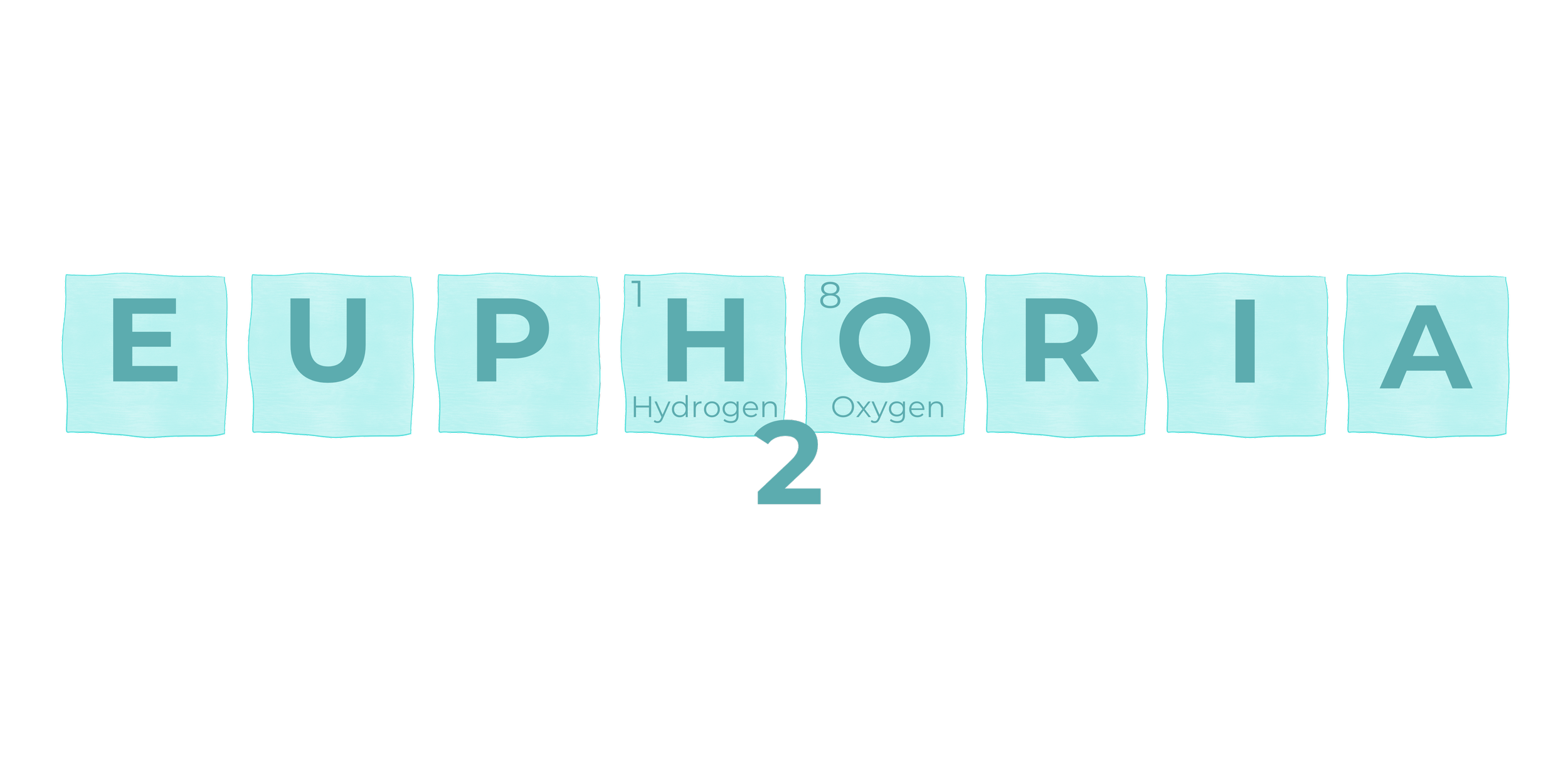
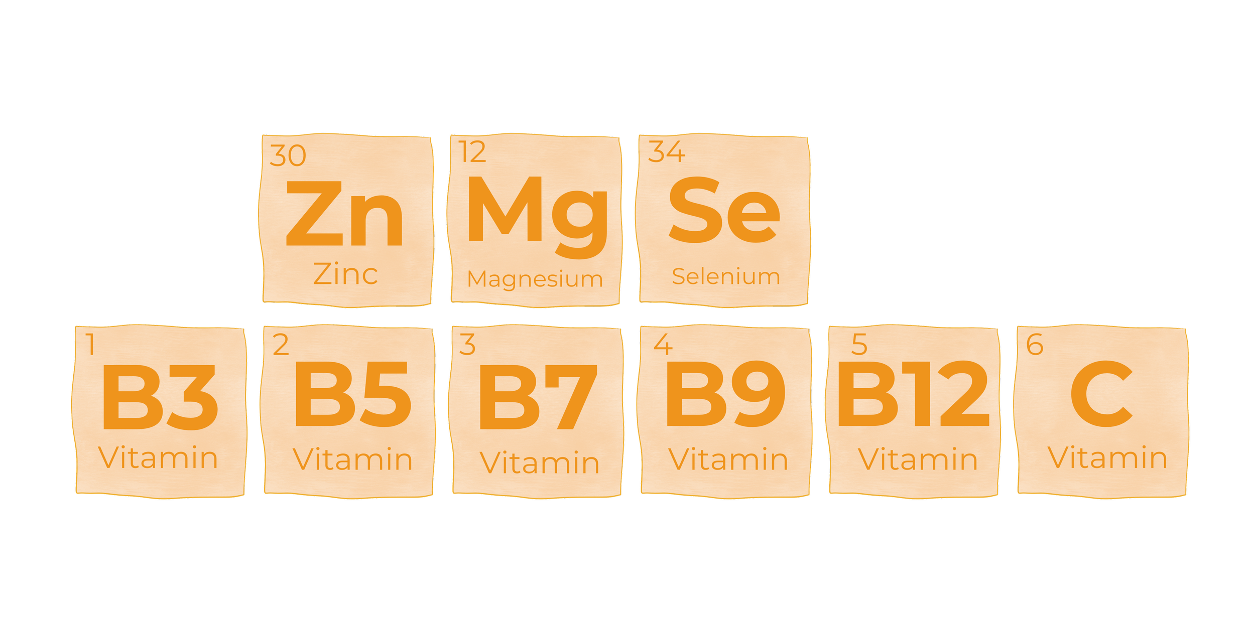
Euphoria, flavoured water to feel Euphoric

Concept 2: Periodic Table, a playful & educational direction


Concept 2: Rothko, an artistic & modern direction
Reload Travel, an artistic touch for a boutique travel agency

Inspired by Beetroot’s “Romeo and Juliet, finally brought together,” which connected the words Romeo and Juliet with 55,440 red lines, here we bring together words that are at the heart of Reload. You’ll see the text we wrote on the website we designed, from start to finish in purple with 496 yellow lines, Reload’s company colours.
Silkscreen printing on Munken paper.
In the works…
-
![]()
Pawlive
-
![]()
Coming soon...
-
![]()
Teapsule Non-Organic
-
![]()
GREET


Contact us